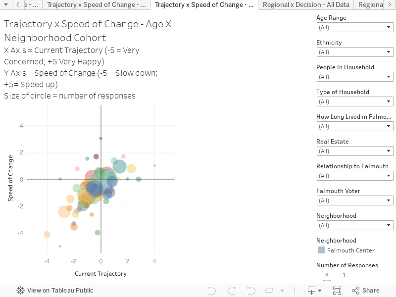
Current Trajectory and Speed of Change – Age X Neighborhood Cohort
Current Trajectory (X Axis) x Current Speed of Change (Y Axis)
This chart combines responses to two questions to create an interactive scatter plot. This chart presents the results via respondents age and neighborhood cohort. You can hover over the chart to reveal more information on each circle.
The chart is structured as follows:
X-Axis is the response to the question “Considering the current trajectory of the community (thinking about changes and where the community has been/is heading), how happy or concerned are you about the OVERALL current trajectory?”. The scale is: -5 = Very concerned; 0 = Neutral; 5 = Very happy
Y-Axis is the response to the question “Thinking about the current (or recent) speed of change in Falmouth, OVERALL do you think Falmouth is changing too quickly (where it is overwhelming the community) or too slowly (where Falmouth is getting left behind)?”. The scale is: -5 = We need to slow down; 0 = Neutral; 5 = We need to speed up
Key things to note:
This combination of filters (Age and Neighbourhood) creates 104 possible cohort groups.
This visualization highlights the degree that some older age cohorts, in the western neighbourhoods, have higher levels of concern about trajectory and speed of change.
Using the filters on the Right-hand side allow you to compare responses from neighbourhoods. For example, selecting Leighton Hills and Brookside, and The Flats – shows a distinctly different level of concern across age groups.