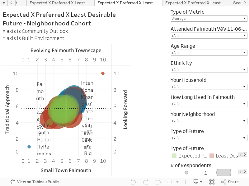
This chart shows the responses to the future scenario questions in Community Survey #2. The chart represents all responses, for the Expected, Preferred and Least Desirable Futures. These are groups in Neighborhood Cohorts.
Key things to note:
This approach averages the responses by neighbourhood cohort for each type of future .
On the top left of the filter column, there is a selection called ‘Type of Metric’. This will allow viewing of Average or Median, which is shown as a dotted line on the chart.
Selecting the Median or Average will help reveal some of the differences in Neighbourhoods. For example, using the Median, it shows the that Leighton Hill and Brookside see the Least Desirable future as 10 x 10; whereas South Foreside and The Flats see 2×2 as the Least Desirable.