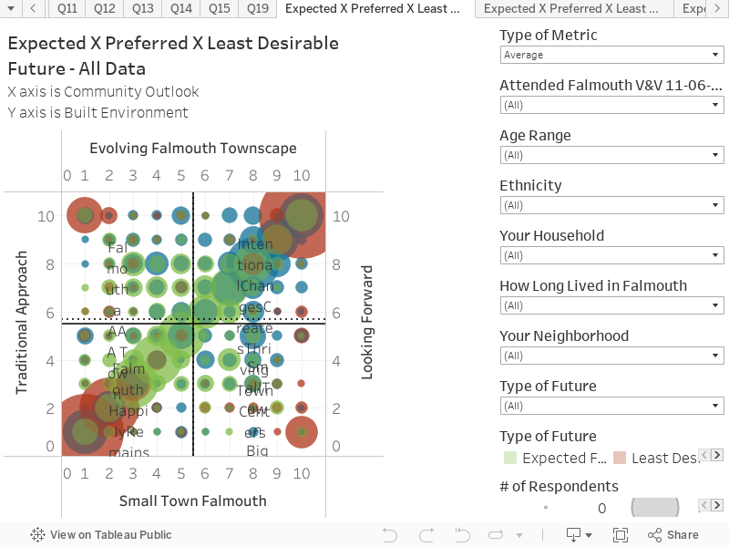
This chart shows the responses to the future scenario questions in Community Survey #2. The chart represents all responses, for the Expected, Preferred and Least Desirable Futures. These can be selected in the filter on the right-hand side (at the bottom of the filter chart). The scenario matrix is further explained in the Think Tank report, and in the Final Report for the Vision and Values project. The chart is structured as follows:
X axis is Community Outlook
Y axis is Built Environment
Key things to note:
The Least Desirable future responses show that the corners of the scenario matric were the least attract to people. This highlights the ‘narrowing of the lens’ into the scenario matrix.
The Preferred Future falls within the scenario B – Intentional Change Creates Thriving Town Centers.
This data can be filtered by the profile questions to reveal cohort responses. For example, households with retirees tend to skew more to the Scenario B as the preferred future.
On the top left of the filter column, there is a selection called ‘Type of Metric’. This will allow viewing of Average or Median, which is shown as a dotted line on the chart.