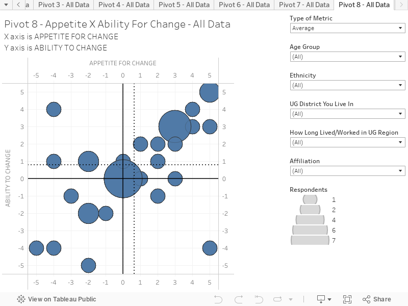
Appetite for Change (X-Axis) x Ability to Change (Y-Axis) This chart combines responses to two questions to create an interactive scatter plot. This chart presents the average results based on all respondents. You can hover over the chart to reveal more information on each circle. The chart is structured as follows:
X-Axis is the response to the question “In a rapidly changing world, having the appetite for change is critical. Do you think that local leadership in KCK has an appetite for change? (Scale: -5 = Very little appetite for change; 0 = Neutral; +5 = Very strong appetite for change.)
Y-Axis is the response to the question” In a rapidly changing world, having the ability to change is critical. Do you think that local leadership in KCK has the ability to change? (Scale: -5 = Very little ability to change; 0 = Neutral; +5 = Very strong ability to change.)
Key things to note:
The size of the circle denotes the popularity of the response. Survey respondents had mixed responses to this question. These sentiments should be explored more during the visioning and planning process.
The responses can be filtered according to respondent age, ethnicity, UG District you live in, and affiliation.