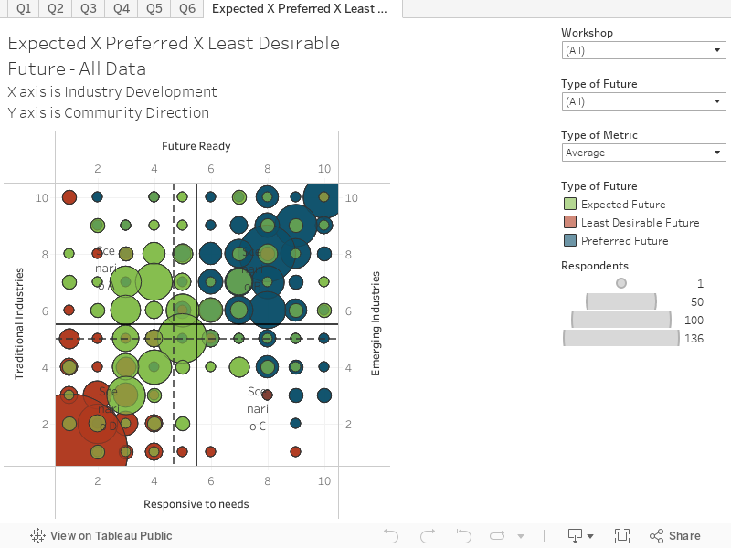
This chart combines responses from attendees at all engagement workshops regarding their least desirable, expected and preferred futures. Attendees were asked to plot their responses on a 100 cell grid. The chart shows the least desirable future in red, expected future in green and preferred future in blue. The size of the circle represents the popularity/how many respondents opted for that cell. You can hover over the chart to reveal more information on each circle.
X axis is Industry Development
Y axis is Community Direction
Key things to note:
This question can be filtered to allow you to explore responses from different workshops, types of future and types of metric.
The Think-Tank workshop attendees were in almost total agreement about Scenario B representing the preferred future, Scenario D representing the least desired future and the expected future predominantly being Scenario A and D.
All of the 9 countywide workshops generally opted for Scenario B representing the preferred future and Scenario D representing the least desired future. The expected future changed per workshop but was predominantly mirroring that of the Think-Tank (Scenario A and D).
North Ridgeville workshop attendees were not so clear in their choices and the expected future was scattered across most Scenarios, as was Wellington.
The Wellington workshop attendees’ preferred future was both Scenario B and C.
The Virtual workshops attendees opted for Scenarios A, B and D for their expected futures.