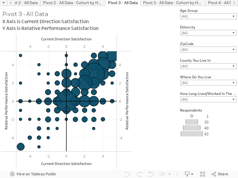
This chart combines responses to two questions to create an interactive scatter plot. This chart presents the results based on all respondents. You can hover over the chart to reveal more information on each circle. The chart is structured as follows:
X-Axis is the response to the question “How satisfied or concerned are you about the way the region is changing and the overall current direction of the Greater Mankato region?” SCALE: -5 = Very concerned; 0 = Neutral; 10 = Very satisfied
Y-Axis is the response to the question “How satisfied or concerned are you about the current relative performance of the Great Mankato region, compared to other regional areas?” SCALE: – 5 = Very concerned (we are falling behind); 0 = Neutral; +5 Very satisfied (we are doing great and better than everyone else)
Key things to note:
This chart shows that people are generally satisfied with the current direction and relative performance of the region. Most responses are clustered in the upper right quadrant.
In contrast to the upper right responses, there is a significant number of responses scattered across the rest of the chart, suggesting there is a noteworthy number of people who are not satisfied or even have levels of concern about the direction and performance.