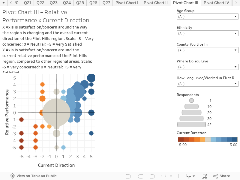
Current Direction and Performance of the Flint Hills region
This chart combines responses to two questions to create an interactive scatter plot. This chart presents the results based on all respondents. You can hover over the chart to reveal more information on each circle. The chart is structured as follows:
X-Axis is the response to the question “How satisfied or concerned about you about the way the region is changing and the overall current direction of the Flint Hills region?” The scale is -5 = Very concerned; 0 = Neutral; 5 = Very satisfied
Y-Axis is the response to the question “How satisfied or concerned about you about the current relative perforce of the Flint Hills region, compared to other regional areas?”. The scale is -5 = Very concerned; 0 = Neutral; 5 = Very satisfied
Key things to note:
The size of the circle denotes the popularity of response. There was a wide spread of responses with the majority of respondents satisfied with both the current direction and relative performance of the Flint Hills region. However there are outliers who are concerned about the current direction and relative performance of the Flint Hills region. These are represented on the chart as the smaller dots on the left hand side and bottom of the chart.
Use the filters on the right hand side to view how these results change depending on age cohort, ethnicity, county, type of residency and length of time spent living/working in the Flint Hills region.