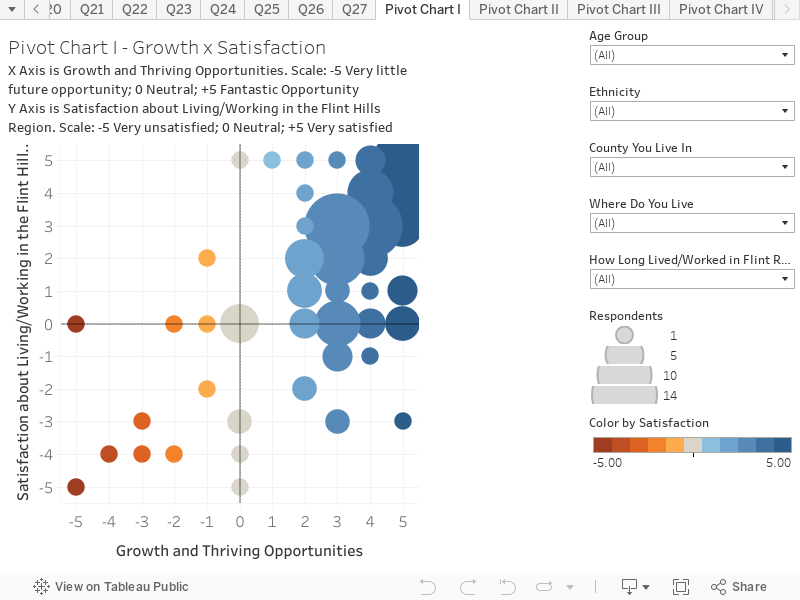
Satisfaction & Growth Opportunities in the Flint Hills Region
This chart combines responses to two questions to create an interactive scatter plot. This chart presents the results based on all respondents. You can hover over the chart to reveal more information on each circle. The chart is structured as follows:
X-Axis is the response to the question “Do you think this region offers you future opportunities to grow and thrive, in your live, interests, career and/or business.? The scale is -5 = Very little opportunity; 0 = Neutral; 5 = Fantastic opportunity
Y-Axis is the response to the question “How satisfied about you about living and/or working in the Flint Hills region?”. The scale is -5 = Very unsatisfied; 0 = Neutral; 5 = Very satisfied
Key things to note:
The size of the circle denotes the popularity of response. The majority of responses were in the upper right section of the chart. This shows that the majority of respondents think that there are fantastic opportunities for growth in the Flint Hills region.
The position of the circles also shows that most of the respondents are very satisfied with living/working in the Flint Hills region.
Use the filters on the right hand side to view how these results change depending on age cohort, ethnicity, county, type of residency and length of time spent living/working in the Flint Hills region.