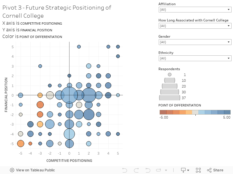
This chart combines responses to two questions to create an interactive scatter plot. This chart presents the results based on all respondents. You can hover over the chart to reveal more information on each circle. The chart is structured as follows:
X-Axis is the response to the question “How well positioned is Cornell College for a future when declining traditional student enrollment base may increase competition for students between institutions of higher education?” The scale is -5 = Very poorly positioned; 0 = Neutral; +5 = Very strongly positioned
Y-Axis is the response to the question “Change and innovation cost money and people trust strong and reliable institutions. How well positioned is Cornell College financially to invest the resources needed for change and innovation?” The scale is -5 = Very poorly positioned; 0 = Neutral; +5 = Very well positioned
Color Scale is the response to the question “Cornell College has a strong point of differentiation because of the Block Plan. How relevant and effective do you think this differentiating approach will be in 10 years? SCALE: -5 = Much less relevant; 0 = Neutral; +5 = Much more relevant