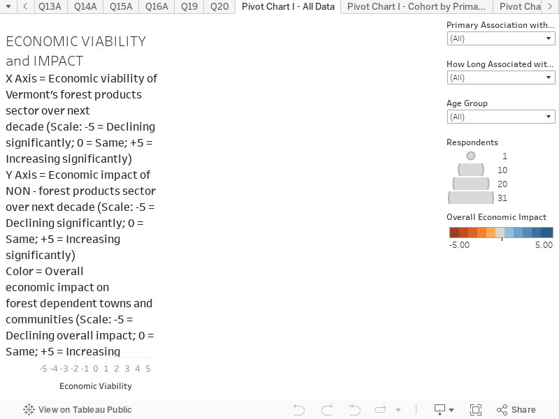
This chart combines responses to three questions to create an interactive scatter plot. This chart presents the results based on all respondents. You can hover over the chart to reveal more information on each circle. The chart is structured as follows:
X-Axis is the response to the question “Over the next decade, do you see the economic viability of Vermont’s forest products sector increasing or decreasing?”. Scale: -5 = Declining significantly; 0 = Same; +5 = Increasing significantly
Y-Axis is the response to the question “Over the next decade, do you see the economic impact of Vermont’s forest economy, not including the forest products sector increasing or decreasing?”. Scale: -5 = Declining significantly; 0 = Same; +5 = Increasing significantly
Color is a scale in response to the question “Over the next decade, do you see the overall economic impact of Vermont’s forest economy on forest dependent communities increasing or decreasing?” Scale: -5 = Declining overall impact; 0 = Same; +5 = Increasing overall impact
Key things to note:
Responses show some significant concern about the future viability about the traditional forest products sector, and more optimism about the future of the non-forest products portion of the forest economy.
There is a cluster of responses in the upper right quadrant, of people who are positive about all three dimensions, and a group in the lower left quadrant who see greater concern for the future.
The filters on the right hand side can be used to explore various stakeholder groups. For example, Foresters tend to be see more decline in forest products than groups involved in outdoor recreation.