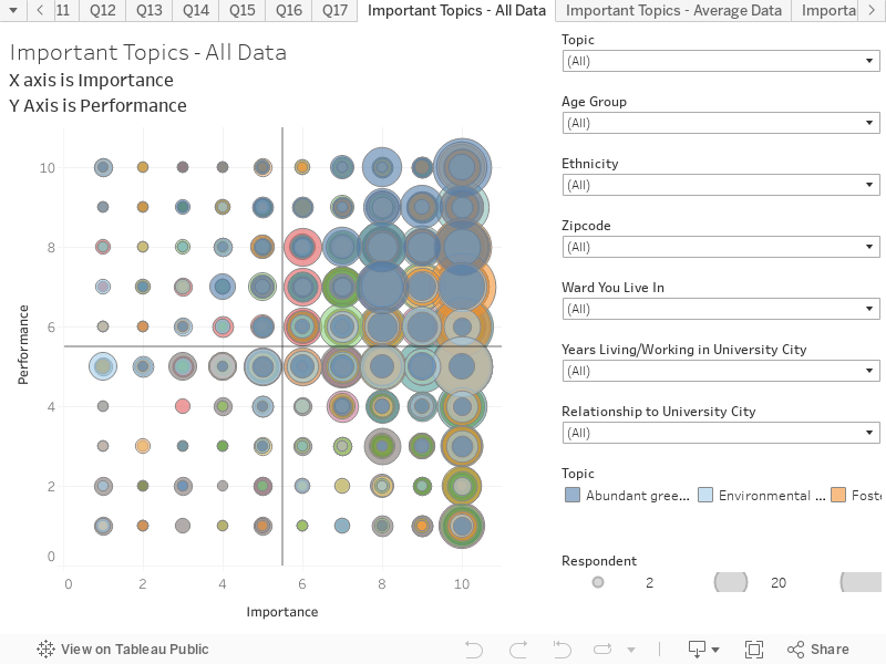
Performance by University City (Y Axis) x Importance of Key Topics (X Axis)
This chart combines responses to two questions to create an interactive scatter plot. This chart presents the results based on all respondents. You can hover over the chart to reveal more information on each circle. The chart is structured as follows:
Y-Axis is the response to the question “How well do you think University City is currently doing on each of these issues”. The scale is: 1 = Not well at all; 10 = Extremely well
X-Axis is the response to the question “How importance do you think these issues and topics are in terms of the future of University City over the next 10 years?” The scale is: 1 = Not at all important; 10 = Critically Important
Key things to note:
The majority of respondents felt that University City was performing well with regards to the outlined issues.
Abundant green space and public parks was seen as the most important issue and one where University City was performing extremely well.
For more information about University City’s Community Vision Project, please contact:
Dawn Beasley, Assistant City Manager City of University City 6801 Delmar Boulevard University City, MO 63130 Phone: 314.505.8533 Email: dbeasley@ucitymo.org