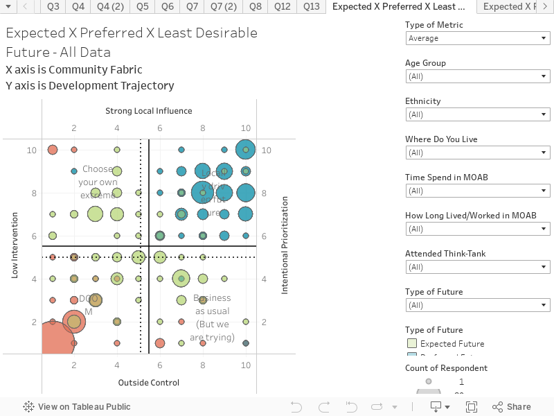
This chart shows the responses to the future scenario questions in the Vision Survey. The chart represents all responses, for the Expected, Preferred and Least Desirable Futures. These can be selected in the filter on the right-hand side (at the bottom of the filter chart). The scenario matrix is further explained in the Think Tank report. The chart is structured as follows:
X axis is Development Trajectory
Y axis is Community Fabric
Key things to note:
The Least Desirable future was firmly based in Scenario D – DOOM. The bottom left hand side of this quadrant had the most responses regarding this being the least desirable future. The size of circle denotes the amount of responses. The larger the circle, the more responses.
The Preferred Future falls within the Scenario B – Locally Driven Future.
This data can be filtered by the profile questions to reveal cohort responses.
On the top left of the filter column, there is a selection called ‘Type of Metric’. This will allow viewing of Average or Median, which is shown as a dotted line on the chart.
MORE INFORMATION
For more information about ‘Moab – Tomorrow Together’, please contact: