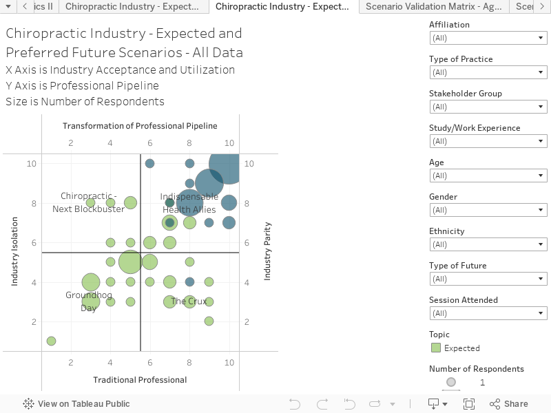
Heat Map – Expected and Preferred Futures – All Data
The development of Expected and Preferred Futures ‘Heat-maps’ is a key part of discovering the shared vision. During the survey, people were asked to indicate on a 10 x 10 matrix (overlaying the scenario quadrants), the location of what we call the ‘Expected’ and ‘Preferred’ future.
The Expected future is in green, and it is where people believe the ‘the future you expect mostly likely to eventuate by 2030, if the industry and profession stays on existing trajectory’
The Preferred future is in blue, and it is what people have identified as the future you think is most optimal for the industry and profession to aim for in 2030.
The circles (or dots) represent the number of responses at each point in the matrix. The responses may be further filtered, using the filters’ drop-down menus to the right of the chart. The specific number of responses for each point on the chart may be seen by hovering over the circles within the graph.
Key things to note:
The filter named ‘Future’ at the bottom of the right-hand side filter menu allows you to toggle between expected and preferred future.
The distribution of Preferred Future shows a tight concentration of responses in the upper right quadrants (Scenario ‘Indispensable Health Allies’).
The gap between the expected and preferred future concentrations suggests a strong appetite for change along both axes.