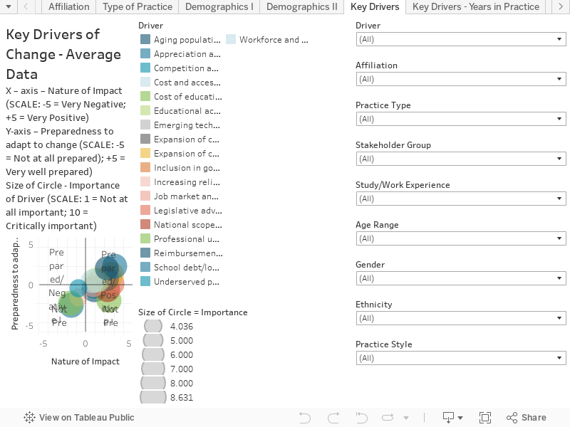
This chart combines responses to three questions to create an interactive scatter plot. This visualization shows response data as it relates to all 19 Key Drivers. This chart presents the average results based on all respondents. You can hover over the chart to reveal more information on each circle, including the number of respondents.
Note:Drivers are defined as major events, trends, developments, catalysts or forces that actively influence or cause change. You can identify the driver and the cohort by hovering over each bubble of data. You can also filter out individual drivers by using the filters on the right-hand side.
The chart is structured as follows:
X – axis – Nature of Impact (SCALE: -5 = Very Negative; +5 = Very Positive) – NATURE OF IMPACT – Do you think expected changes (over the next 10 years) in each of these drivers, will have a positive or negative impact on the chiropractic profession?
Y-axis – Preparedness to adapt to change (SCALE: -5 = Not at all prepared); +5 = Very well prepared) PREPAREDNESS – How well prepared is the chiropractic profession to adapt to changes in these drivers?
Size of Circle – Importance of Driver (SCALE: 1 = Not at all important; 10 = Critically important) IMPORTANCE – How important do you think the following drivers are in shaping the future of the chiropractic profession (looking out to 2030)?